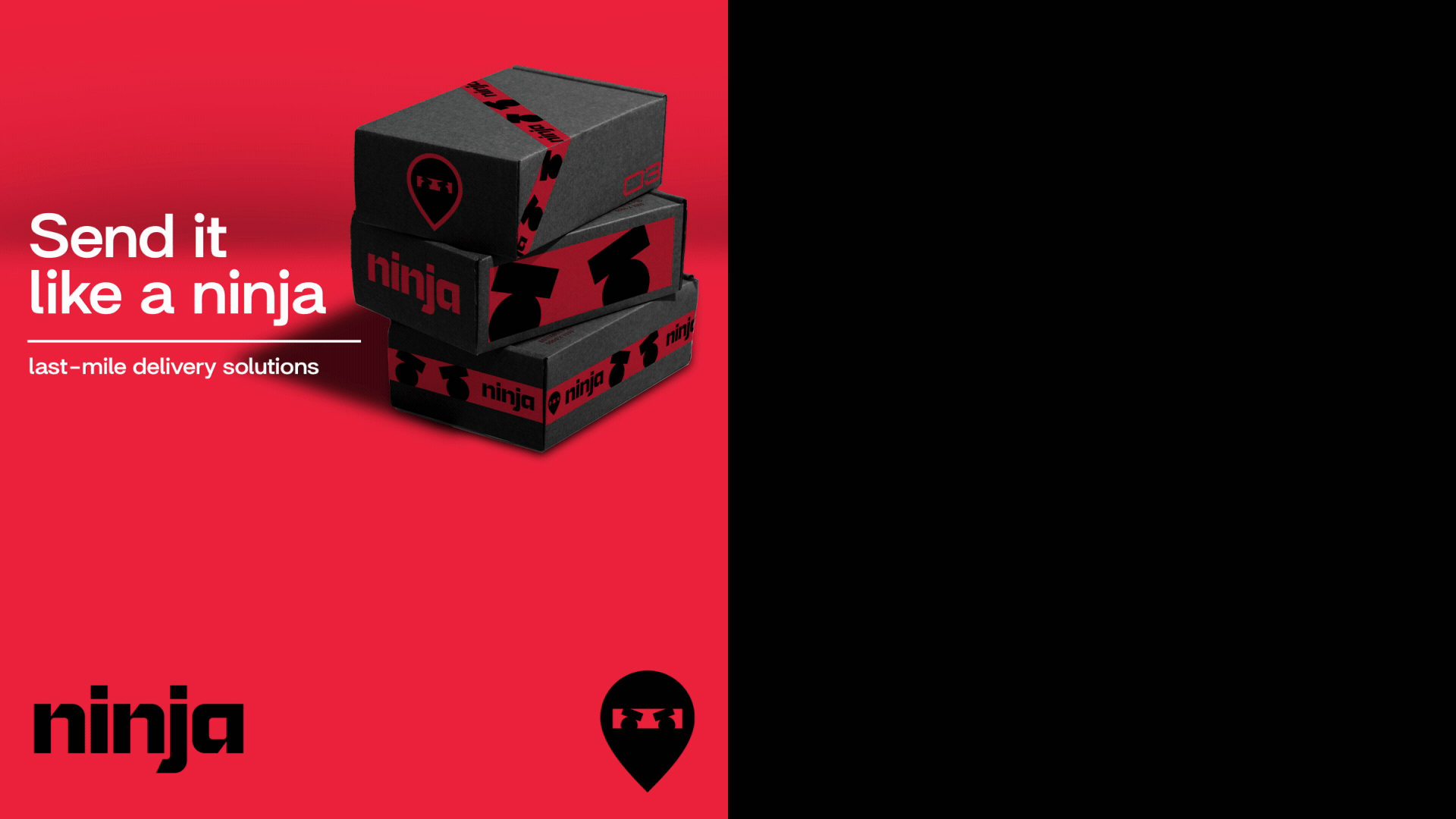
Send it
like a ninja!
ninjavan, singapore
The challenge
In order to reflect its next phase of growth beyond being a last-mile delivery company to becoming a complete logistical ecosystem across Southeast Asia, Ninja Van needed to evolve its visual identity and communication strategy.
Although friendly and approachable at its core, the previous identity failed to embody the efficacy and pioneering spirit of a future-proof logistics company operating on a global scale. The outdated identity made the brand feel smaller and less impactful than it truly was, limiting its potential to convey its ambitious vision.
The Opportunity
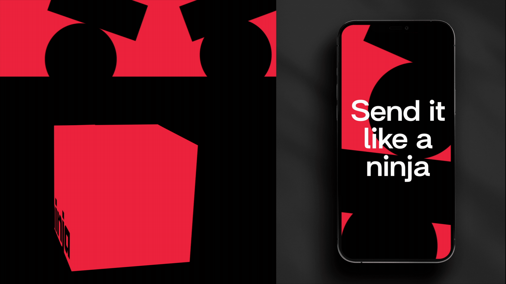
The new visual identity focuses on the essence of what it means to be a ninja: precision, efficiency, and dynamism. Without losing the characterful essence of the mascot ninja, the design evolves to emphasize its core attributes. The mascot is now more subtle, with a focus on the eyes to symbolize vision and attention to detail.
To strengthen the brand and allow it to encompass all dimensions of logistics, the name was shortened to simply “Ninja.”
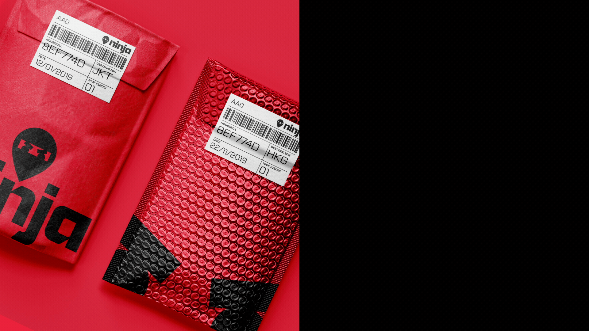
The revamped brand world is dynamic and iconic, using the shape of the ninja’s eyes as a recurring element representing various package shapes. This approach creates depth and dynamism while ensuring visual consistency. The angular features of the wordmark enhance this 3D effect, tying together all elements of the visual identity cohesively.